Ap Statistics Transformations To Achieve Linearity Worksheet
Onlines
Mar 10, 2025 · 6 min read
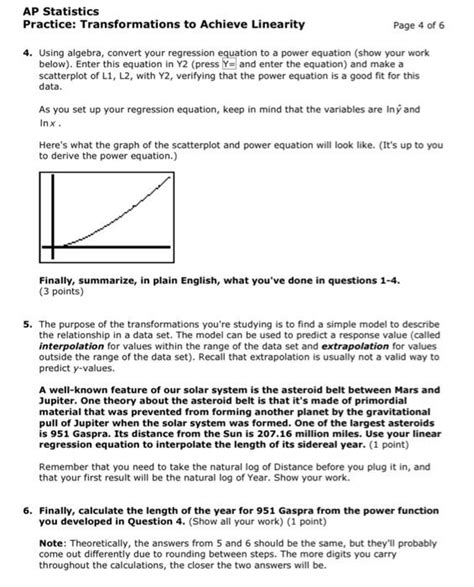
Table of Contents
AP Statistics: Transformations to Achieve Linearity Worksheet – A Comprehensive Guide
Transformations are a crucial aspect of AP Statistics, particularly when dealing with regression analysis. Often, the relationship between two variables isn't perfectly linear, hindering the accuracy and reliability of linear regression models. This article delves deep into the various transformations used to achieve linearity, providing a detailed explanation and numerous examples to help you master this concept. We'll move beyond a simple worksheet and explore the "why" behind the transformations, empowering you to confidently tackle any linearity problem you encounter.
Understanding Linearity and its Importance in Regression
Before we dive into transformations, let's solidify our understanding of linearity in the context of regression analysis. Linearity assumes a straight-line relationship between the independent (x) and dependent (y) variables. This is essential because linear regression models are based on this assumption. If the relationship isn't linear, the model's predictions will be inaccurate, and the statistical inferences drawn from it will be unreliable. Visualizing the data through scatter plots is the first step in assessing linearity. A curved or scattered pattern indicates a potential violation of this assumption.
Identifying Non-Linear Relationships
There are several visual cues that suggest a non-linear relationship:
- Curved patterns: The points on the scatter plot appear to follow a curve rather than a straight line. This could be a parabola, an exponential curve, or some other non-linear function.
- Fanning or Coning: The spread of the data points increases or decreases systematically along the x-axis. This indicates heteroscedasticity, a violation of the assumption of constant variance.
- Clustering: The data points cluster in specific regions of the scatter plot, leaving significant gaps elsewhere.
Common Transformations for Achieving Linearity
Several mathematical transformations can help linearize data. The choice of transformation depends on the specific pattern of non-linearity observed in the scatter plot. Here are some of the most frequently used transformations:
1. Logarithmic Transformation (Log Transformation)
The logarithmic transformation involves taking the logarithm (usually base 10 or natural logarithm) of one or both variables. This is particularly effective when the relationship appears exponential. The formula is:
- y' = log(y) or x' = log(x) or both.
When to use: When the scatter plot shows an exponential growth or decay pattern.
Example: Consider a scenario where the growth of a population follows an exponential curve. Taking the logarithm of the population size (y) might linearize the relationship with time (x).
2. Square Root Transformation
This transformation involves taking the square root of the variable. It's less aggressive than the logarithmic transformation and is useful when the data has a right-skewed distribution or when the spread of the data increases with the mean. The formula is:
- y' = √y or x' = √x
When to use: When the data shows a moderate degree of non-linearity and right skewness.
Example: Analyzing the relationship between the area of a square (x) and its side length (y). The square root transformation might linearize this inherently quadratic relationship.
3. Reciprocal Transformation
The reciprocal transformation replaces the variable with its inverse (1/x or 1/y). This transformation is effective when the relationship shows a hyperbolic pattern. The formula is:
- y' = 1/y or x' = 1/x
When to use: When the relationship between variables displays a hyperbolic or reciprocal pattern.
Example: Modeling the relationship between speed and travel time. As speed increases, travel time decreases, following a reciprocal relationship.
4. Power Transformations (Box-Cox Transformation)
The Box-Cox transformation is a more general approach that encompasses several transformations. It involves raising the variable to a power (λ). The formula is:
- y' = (y^λ - 1) / λ
The optimal value of λ is determined through a process of iteration, often using statistical software. When λ=0, this transformation becomes the natural logarithm transformation. When λ=0.5, it is equivalent to the square root transformation. When λ=1, no transformation is needed.
When to use: When other transformations aren't sufficient to achieve linearity. It's a more flexible and powerful technique.
5. Polynomial Transformations
Polynomial transformations involve adding polynomial terms to the model. This is particularly useful when the relationship between variables appears curved. The simplest form involves adding a squared term:
- y = β₀ + β₁x + β₂x² + ε
where β₀, β₁, and β₂ are regression coefficients, and ε represents the error term. Higher-order polynomial terms can be added if needed, but too many terms can lead to overfitting.
When to use: When the relationship between variables appears quadratic or cubic.
Choosing the Right Transformation: A Step-by-Step Approach
Selecting the appropriate transformation requires careful consideration. Here’s a step-by-step approach:
-
Visual Inspection: Begin by creating a scatter plot of your data. This provides the most immediate visual assessment of the relationship between variables. Look for patterns that suggest exponential, quadratic, or reciprocal relationships.
-
Consider the Nature of the Variables: The nature of the variables can offer clues about appropriate transformations. For instance, if a variable represents a count, a logarithmic or square root transformation might be suitable.
-
Try Different Transformations: Experiment with several transformations (logarithmic, square root, reciprocal) to see which one best linearizes the data. You can assess linearity by visually inspecting scatter plots of the transformed data and checking the correlation coefficient.
-
Evaluate Residual Plots: After applying a transformation, check the residual plot (a plot of the residuals versus the fitted values). A well-behaved residual plot should show randomly scattered points around zero. A systematic pattern indicates that the transformation hasn't fully achieved linearity.
-
Statistical Software: Statistical software packages (like R or SPSS) can help in selecting the optimal transformation, particularly with the Box-Cox transformation.
Interpreting Results After Transformation
Once a transformation has successfully linearized the data, the interpretation of the regression model needs to be adjusted. The regression coefficients now represent the relationship between the transformed variables, not the original ones. You need to back-transform the predictions to obtain meaningful interpretations in the original units. For example, if you used a logarithmic transformation on the dependent variable, you'll need to exponentiate the predicted values to get predictions in the original scale.
Common Mistakes to Avoid
- Over-Transforming: Applying multiple transformations without a clear justification can lead to over-fitting and misinterpretations.
- Ignoring Residual Plots: Failing to check residual plots after transformation can lead to inaccurate conclusions about linearity.
- Ignoring the Context of the Data: The choice of transformation should be guided by the context and nature of the variables involved.
Conclusion: Mastering Transformations for Linearity
Transformations are an indispensable tool in regression analysis, enabling the application of linear models to data that doesn't initially exhibit a linear relationship. Mastering these techniques ensures that your statistical analyses are accurate, reliable, and yield meaningful interpretations. Remember to carefully consider the visual cues, the nature of your variables, and always validate your chosen transformation using residual plots. By following the steps outlined in this guide, you'll be well-equipped to confidently handle linearity challenges in your AP Statistics work. Practice makes perfect; continue to explore different datasets and apply these techniques to solidify your understanding. Remember that the goal isn’t just to achieve linearity but to also understand why a specific transformation is appropriate for your specific data. This understanding is critical for drawing meaningful conclusions from your statistical analyses.
Latest Posts
Latest Posts
-
Fundamentals Of Electric Circuits 7th Edition Solutions Pdf
Mar 10, 2025
-
It Is Always Best To Avoid Conducting Nonexperimental Research
Mar 10, 2025
-
Integumentary System Worksheet 1 Answer Key
Mar 10, 2025
-
The Category Management Dashboards Are Open To
Mar 10, 2025
-
Po Box 6497 Sioux Falls Sd 57117
Mar 10, 2025
Related Post
Thank you for visiting our website which covers about Ap Statistics Transformations To Achieve Linearity Worksheet . We hope the information provided has been useful to you. Feel free to contact us if you have any questions or need further assistance. See you next time and don't miss to bookmark.
