Label The Illustrations Based On The Gestalt Principles Of Grouping.
Onlines
Mar 31, 2025 · 6 min read
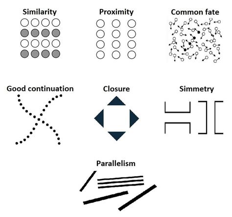
Table of Contents
Labeling Illustrations Based on Gestalt Principles of Grouping
Gestalt psychology offers a powerful framework for understanding how humans perceive visual information. Instead of seeing individual elements, we tend to group them into meaningful wholes based on inherent principles. These principles, known as the Gestalt principles of grouping, are crucial for creating effective and visually appealing designs, from logos and websites to illustrations and infographics. This article will delve into these principles, providing detailed explanations and examples, ultimately guiding you on how to label illustrations accurately based on their inherent grouping.
Understanding Gestalt Principles
Before we jump into labeling, let's refresh our understanding of the key Gestalt principles:
1. Proximity: Nearness Implies Connection
The principle of proximity states that objects placed close together are perceived as a group. The closer the objects, the stronger the perceived connection. This is a fundamental principle used in almost all visual design.
Example: Imagine a scatter plot of dots. If dots are clustered together, we automatically perceive those clusters as separate groups, even without any explicit lines or borders.
Labeling implications: When labeling an illustration based on proximity, group labels should reflect the close spatial relationships. Instead of labeling individual elements, label the entire cluster as a single unit. For instance, if several similar objects are clustered together, you might label the cluster "Group A" rather than labeling each individual object.
2. Similarity: Like Things Belong Together
Similarity refers to our tendency to group elements that share visual characteristics, such as shape, size, color, or texture. Similar items are seen as belonging together, even if they are not physically close.
Example: A field of sunflowers. Despite their spatial distribution, the viewer instantly recognizes them as a unified group due to their shared visual characteristics.
Labeling implications: When labeling based on similarity, use descriptive labels that highlight shared characteristics. For instance, in an illustration showing various types of fruits, you might label groups as "Citrus Fruits," "Berries," and "Stone Fruits," rather than individually labeling each fruit.
3. Closure: Completing the Incomplete
Closure is our ability to perceive incomplete figures as complete wholes. Our brains automatically fill in the gaps to create a meaningful form. This principle plays on our inherent pattern-recognition abilities.
Example: The classic WWF panda logo utilizes closure. Even though the panda image is not fully drawn, we instantly recognize it because our brain fills in the missing parts.
Labeling implications: When labeling illustrations that utilize closure, the label should reflect the perceived whole, not the individual incomplete elements. If the illustration uses implied lines or shapes, the label should describe the completed form.
4. Continuity: Following the Flow
Continuity refers to our preference for perceiving continuous smooth forms rather than discontinuous ones. We tend to follow lines and curves, perceiving them as a single, unbroken entity.
Example: A winding road snaking through a landscape. Our eyes naturally follow the path of the road, perceiving it as a continuous entity rather than a series of disconnected segments.
Labeling implications: When labeling an illustration based on continuity, follow the natural flow of the elements. Labels should reinforce the sense of movement and connection between elements. Use directional cues in your labels to further emphasize the continuity.
5. Common Fate: Moving Together, Belonging Together
Common fate refers to our tendency to group elements that move in the same direction and at the same speed. This principle is particularly relevant in animation and dynamic visuals.
Example: A flock of birds flying in formation. Despite the individual birds, they are perceived as a single unit due to their shared movement.
Labeling implications: When labeling illustrations depicting movement or implied movement, the labels should reflect the shared destiny of the elements. Use verbs and action words to describe the collective movement.
6. Figure-Ground: Separating Object from Background
The figure-ground principle distinguishes between the main focus (figure) and the background (ground). Our visual system naturally separates the figure from the ground, making the figure stand out.
Example: A vase or two faces illusion. This classic example shows how the same elements can be perceived either as a vase against a background or as two faces facing each other. The perception depends on which elements are perceived as figure and which as ground.
Labeling implications: When labeling illustrations, ensure your labels clearly distinguish between the figure and the ground. Labels for the figure should be prominent and easily readable, while background elements might have less prominent labeling or no labeling at all. Consider using different font sizes, colors, or styles to create a visual hierarchy that reinforces the figure-ground relationship.
7. Prägnanz (Law of Good Figure): Simplicity and Order
Also known as the law of simplicity or good figure, Prägnanz states that we perceive objects in the simplest and most stable form possible. We tend to resolve ambiguity by selecting the most organized and straightforward interpretation.
Example: The Olympic rings are a perfect example. We easily perceive five distinct rings even though they overlap, demonstrating our preference for simple and stable forms.
Labeling implications: When labeling, strive for simplicity and clarity. Avoid overly complex or ambiguous labels. Keep the language concise and to the point, reflecting the straightforward nature of the perceived forms.
Practical Application: Labeling Illustrations
Let's consider a few practical examples of how to label illustrations based on these principles:
Example 1: A Scatter Plot Showing Customer Demographics
Imagine a scatter plot showing customer demographics, with different colors representing age groups and sizes representing income levels.
-
Labeling based on Proximity: You might group clusters of similar data points and label them "Young, Low Income," "Middle-Aged, Medium Income," and "Older, High Income."
-
Labeling based on Similarity: You would use color-coded legends to describe each age group and a size key to explain income levels.
Example 2: An Illustration of a Food Web
An illustration showing various organisms in a food web, with arrows indicating predator-prey relationships.
-
Labeling based on Proximity & Continuity: Group organisms based on their trophic levels (producers, primary consumers, secondary consumers, etc.). Use arrows and labels to indicate the flow of energy and nutrients. The proximity of organisms with arrows pointing to each other helps highlight the predator-prey relationships.
-
Labeling based on Similarity: Organisms with similar characteristics can be grouped together based on their type (e.g., "Herbivores," "Carnivores," "Omnivores").
Example 3: A Diagram Showing the Steps in a Process
A flowchart illustrating the steps in a manufacturing process.
-
Labeling based on Continuity & Proximity: Label each step sequentially, with clear indication of the flow of the process. The proximity of steps helps viewers understand the sequence.
-
Labeling based on Similarity: Similar types of steps (e.g., quality control steps) might be grouped together and highlighted with a similar label style.
Advanced Techniques: Enhancing Label Design
Beyond just applying the Gestalt principles, you can further enhance your label design using these techniques:
-
Visual Hierarchy: Employ different font sizes, weights, and colors to guide the viewer's attention. Important labels should stand out more.
-
Whitespace: Use sufficient whitespace around labels to improve readability and avoid visual clutter.
-
Consistent Style: Maintain a consistent style for labels across the entire illustration to improve visual coherence.
Conclusion: Mastering Gestalt for Effective Labeling
Mastering the Gestalt principles of grouping is crucial for creating clear, effective, and aesthetically pleasing illustrations and infographics. By understanding how people naturally perceive visual information, you can design labels that accurately reflect the relationships within your illustrations, enhancing comprehension and engagement. Remember, the key is to use labels to reinforce, not contradict, the inherent grouping suggested by the visual arrangement of elements within the illustration. Through consistent application and creative use of these principles, you can create visuals that communicate effectively and leave a lasting impression.
Latest Posts
Latest Posts
-
Student Exploration Stoichiometry Gizmo Answer Key
Apr 02, 2025
-
Governments Sometimes Set Up A Natural Monopoly When A Venture
Apr 02, 2025
-
Catcher In The Rye Chapter 8 Summary
Apr 02, 2025
-
Self Worth Accomplishment And Confidence Represent The
Apr 02, 2025
-
How To Know My Number On Glo
Apr 02, 2025
Related Post
Thank you for visiting our website which covers about Label The Illustrations Based On The Gestalt Principles Of Grouping. . We hope the information provided has been useful to you. Feel free to contact us if you have any questions or need further assistance. See you next time and don't miss to bookmark.
