What Is The Most Basic Method Of Illustrating Data
Onlines
Apr 06, 2025 · 5 min read
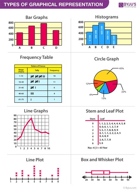
Table of Contents
What is the Most Basic Method of Illustrating Data?
Data visualization is crucial in today's data-driven world. It allows us to understand complex information quickly and easily, making informed decisions based on evidence. While sophisticated tools and techniques exist, the most basic and often the most effective method of illustrating data remains the humble bar chart. This article delves deep into why bar charts reign supreme as the foundation of data visualization, explores their variations, and highlights their strengths and limitations compared to other basic methods.
Understanding the Power of Simple Visualization
Before diving into the specifics of bar charts, let's establish the core reasons why simple data visualization is paramount. Complex datasets, often consisting of thousands or millions of data points, can be overwhelming and difficult to interpret directly. Even skilled analysts can struggle to extract meaningful insights from raw data alone. This is where visualization comes to the rescue.
The fundamental goal of data visualization is clarity. By translating numerical data into a visual format, we can:
- Identify trends and patterns: Quickly spot upward or downward trends, seasonal variations, or outliers that might be missed in raw data.
- Compare data points: Easily compare values across different categories or time periods.
- Communicate insights effectively: Present findings in a clear and understandable manner, regardless of the audience's technical expertise.
- Support decision-making: Provide a visual foundation for evidence-based decision-making processes.
Simple methods, like bar charts, excel at achieving these goals, particularly for audiences unfamiliar with complex statistical analyses.
The Bar Chart: The Workhorse of Data Visualization
The bar chart stands out as the most basic and versatile method because of its straightforward nature and broad applicability. It represents data using rectangular bars, with the length of each bar proportional to the value it represents. This simple yet powerful design makes it easy to compare different categories or groups.
Types of Bar Charts
Bar charts come in various forms, each suited to different data types and analytical goals:
- Vertical Bar Charts: The most common type, with bars extending vertically. Excellent for comparing categories with distinct values.
- Horizontal Bar Charts: Bars extend horizontally. Useful when category names are long or when the number of categories is large, as it prevents overlapping labels.
- Grouped Bar Charts: Used to compare multiple variables within the same categories. For example, comparing sales figures for different products across various regions.
- Stacked Bar Charts: Similar to grouped bar charts, but the bars are stacked on top of each other, showing the contribution of each sub-category to the total value. Useful for showcasing proportions and compositions.
- 100% Stacked Bar Charts: A variation of stacked bar charts where the total height of each bar represents 100%. Excellent for comparing proportions across categories.
Strengths of Bar Charts
- Easy to Understand: Even individuals with limited statistical knowledge can readily grasp the information presented.
- Direct Comparison: Facilitates easy comparison of values across different categories.
- Versatile: Adaptable to various data types and analytical needs, thanks to its various formats (vertical, horizontal, grouped, stacked).
- Effective for Presentation: Clean and visually appealing, making them ideal for presentations and reports.
- Minimalist Design: Avoids unnecessary complexity, focusing on conveying the essential information clearly.
Limitations of Bar Charts
While highly effective, bar charts have certain limitations:
- Not Suitable for Large Datasets: Can become cluttered and difficult to interpret when the number of categories is extremely large.
- Limited Trend Representation: While trends can be observed, bar charts are not the ideal choice for representing continuous trends over time. Line charts are better suited for this purpose.
- Difficulty with Sub-Categories: Handling numerous sub-categories within each main category can lead to complex and difficult-to-read charts.
- Potential for Misinterpretation: Improper scaling or labeling can lead to misleading interpretations.
Comparing Bar Charts with Other Basic Methods
To better appreciate the simplicity and effectiveness of bar charts, let's briefly compare them with other basic methods of data illustration:
Pie Charts
Pie charts represent data as slices of a circle, where each slice's size corresponds to its proportion of the total. While visually appealing, they become less effective with more than 5-6 categories, as distinguishing between small slices becomes challenging. Bar charts generally provide clearer comparisons, particularly when dealing with multiple categories.
Line Charts
Line charts are best suited for visualizing trends over time or continuous data. They connect data points with lines, showing the pattern of change. While helpful for identifying trends, they are not as effective for direct comparisons between distinct categories like bar charts.
Pictograms
Pictograms use images or icons to represent data. While engaging and easy to understand, they can be less precise than bar charts, especially when dealing with fractional values. They are more suitable for illustrative purposes rather than detailed quantitative analysis.
Best Practices for Creating Effective Bar Charts
To maximize the effectiveness of your bar charts, consider these best practices:
- Choose the Right Chart Type: Select the bar chart type that best suits your data and analytical goals.
- Clear and Concise Labels: Use clear and concise labels for both the axes and the legend.
- Appropriate Scaling: Use a scale that accurately represents the data without distorting the visual impression. Avoid truncated axes to prevent misleading interpretations.
- Consistent Color Scheme: Employ a consistent color scheme to enhance visual clarity and improve readability.
- Minimalist Design: Keep the chart clean and uncluttered, avoiding unnecessary decorations.
- Data Accuracy: Ensure the data used is accurate and reliable.
- Contextual Information: Provide sufficient contextual information to help readers understand the data presented.
Conclusion: The Enduring Relevance of Bar Charts
In the vast landscape of data visualization tools, the bar chart remains a cornerstone of effective communication. Its simplicity, versatility, and clarity make it an invaluable tool for presenting data across various fields, from business and finance to science and education. While more advanced techniques have emerged, the bar chart's ability to convey information clearly and concisely ensures its continued relevance as the most basic—and often most effective—method of illustrating data. By adhering to best practices and selecting the appropriate chart type, you can harness the power of bar charts to effectively communicate insights and drive data-informed decisions. Remember, the key to successful data visualization is clarity and understanding, and the simple bar chart excels in delivering both.
Latest Posts
Latest Posts
-
America The Story Of Us Episode 7 Cities Worksheet Answers
Apr 08, 2025
-
Which Type Of Renewability Best Describes A Disability
Apr 08, 2025
-
Electrical Bonding Investigation Plan Quick Check
Apr 08, 2025
-
Before Operating A Centrifuge The Operator Should
Apr 08, 2025
-
The Most Dangerous Game Characters Book
Apr 08, 2025
Related Post
Thank you for visiting our website which covers about What Is The Most Basic Method Of Illustrating Data . We hope the information provided has been useful to you. Feel free to contact us if you have any questions or need further assistance. See you next time and don't miss to bookmark.